| Sign Up For Our Newsletter |
| Sign Up For Our Newsletter |

Using Excel to Display a Scatter PlotThis tutorial will use a linear equation to create a table of values for Y when given a set of x values. The equation which will be used in this example is y=3x-2. Excel will be used to create the values from the equation, will then be used to display a scatter plot of the data, and then will be used to find the best fit for the given data.
Step 1 - Open excel, type x in cell A1 and type y in cell B1.
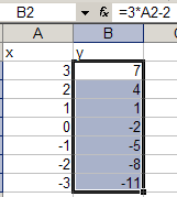
Step 2 - Enter seven values for x in column A. I used 3, 2, 1, 0-, -1, -2, and -3.
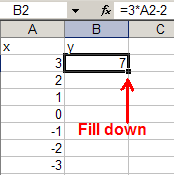
Step 3 - In cell B2 enter the equation Excel will use to calculate Y. The equation will be =3*A2-2
Step 4 - Press Enter after entering the equation. To put the same equation in each of the other cells, click on the cell where the equation is located. Put your cursor on top of the black block on the bottom right corner of the cell. When the cursor turns to a black plus, depress your left mouse button and drag down even with the last value on the left to fill the equation down.
Step 5 - Highlight the data to be turned into a chart. Do not highlight the row headings. An easy way to highlight data is to click one time on the top left number, hold down the Shift key, and with the Shift key depressed, click on the bottom right number. All data between the clicks is highlighted.
Step 6 - Click on the Chart Wizard button or choose Chart from the Insert menu.
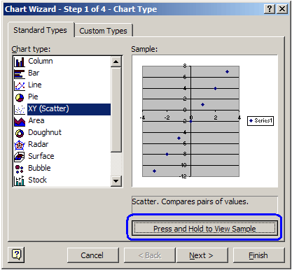
Step 7 - Select XY (Scatter) as the chart type. To see what the chart will look like, click on the button that says Press and Hold to View Sample. As long as you leave the mouse button depressed, you will see the sample graph produced from the data used.
Step 8 - Click the Next button at the bottom of the Chart Wizard window.
Step 9 - The next window is the Source Data window (Step 2 of 4 in the Chart Wizard). There is nothing to change in the window. Press the Next button at the bottom of the Chart Wizard window.
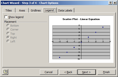
Step 10 - In Step 3 of 4 of the Chart Wizard, Chart Options, I added a title using the Title tab and took the check mark out of the Show Legend box at the Legend tab.
Step 11 - If you want to have a chart that is the size of a worksheet, press the Next button at the bottom of the Chart Wizard window, and select As a new sheet . However, if you want the chart to be as a small object on the same sheet where your data is located, press Finish at the bottom of the Chart Wizard window.
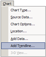
Step 12 - After the chart is created, the Data menu changes to the Chart menu. From the Chart menu select Add Trendline.
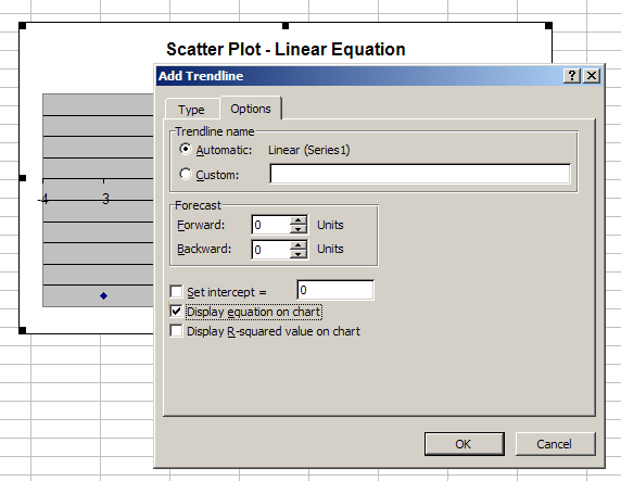
Step 13 - Several options are open to you. I selected Display equation on chart .
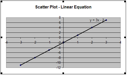
My finished chart, scatter plot, is displayed below:
All of the values used to create the chart above were derived from a linear equation. If this had been the results of an experiment the data would not be so clean. One thing you might do is to go back to the data and create a second set of values. This time insert values for y that would be above or below the calculated values.
Data to use to make a scatter plot - data from the Connecticut Tumor Registry presents age-adjusted numbers of melanoma incidences per 100,000 people for 37 years from 1936 to 1972 (Houghton, Flannery, and Viola, 1980)
Download a Task Card with a lesson on collecting data on the topic radioactive half-life. Instructions are included on this Task Card for collecting data, and entering the data into Excel. The resulting scatter plot would show a nice inverse relationship.
Dealing with Data I: a "simple" linear fit - This page has three data sets which could be used to practice making scatter plots in Excel. [This expired page is from the Internet Archive known as the Wayback Machine.]
Let me know if you have any other ideas for using this feature of Excel. Bill Byles

Internet4classrooms is a collaborative effort by
Susan Brooks and Bill Byles.

advertisement
advertisement
Use of this Web site constitutes acceptance of our Terms of Service and Privacy Policy.