| Sign Up For Our Newsletter |
| Sign Up For Our Newsletter |
Step 1 - Launch Excel - If Excel is already open on your workstation open a new Excel workbook, There are three ways to do that.
1. Go to the Standard toolbar. Click on the New Workbook button.
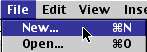
2. Go to the File menu. Select New.
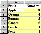
3. Use a keyboard combination: on a Macintosh use Command + N and on a Windows computer use Ctrl + NStep 2 - Enter the data to be graphed. For the purpose of this lesson you will use data from a Favorite Fruit Survey. Enter it as you see below:
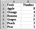
Step 3 - Highlight data to be graphed. Do not include the row with heading titles, only the names of fruit and the numbers. If your worksheet looks like the one above; put your cursor in call A2, click hold the mouse button down and drag to cell B7. Highlighted data should look like the image below:
Note: Cell A2 is selected, the select color extends around the cellStep 4 - Select the Chart Wizard. That is done by going to the Insert menu and selecting Chart. You can also click on the Chart Wizard button on the Standard toolbar.
Step 5 - From the Chart Wizard box that opens select Chart type. For this activity, I selected pie.
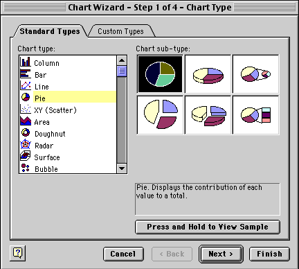
After you have selected the Chart type, click and hold your mouse pointer down on the Press and Hold... button to see what your data looks like in the chart type you selected. If you do not like the look, select another chart type. After you have selected the chart type you will have two options:
- Select Next and let Chart Wizard show you a series of options to make changes to your chart.
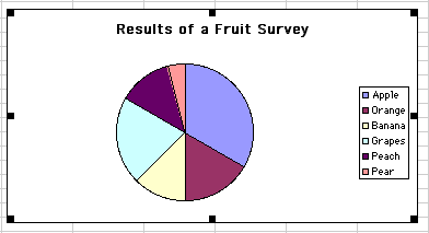
- Select Finish and Chart Wizard puts your completed chart on the spreadsheet. You can see the finished product below.
The second step taken by Chart Wizard is to verify the range of data being used for this chart. The Data range displayed below is read "all cells from A2 to B7."
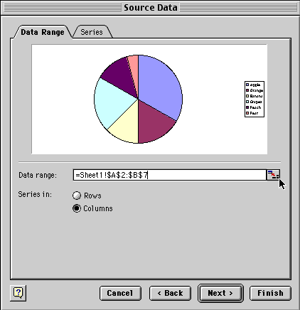
Notice where the cursor is located in the dialog box above. It is pointing to the small box at the end of the line where the Data range is displayed. If the data range should be changed, click on the box the cursor is pointing to.
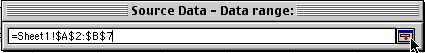
The dialog box shrinks allowing you to see your entire spreadsheet. You can edit the data range in this small window. When you are finished, click the same box at the end to restore the window.
Select Next to go to the dialog box below. This box allows you to add a title to the chart, make changes on the legend, or make changes on the data labels.
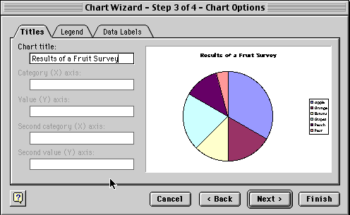
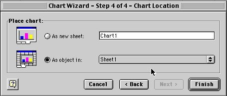
Select Next to move to the final dialog box which allows you to see the chart as a new sheet or place it on one of the sheets in your workbook.
If you let the Chart Wizard finish your chart after the first dialog box, or work through each of the four steps, your chart will look something like the one below.


Internet4classrooms is a collaborative effort by
Susan Brooks and Bill Byles.

advertisement
advertisement
Use of this Web site constitutes acceptance of our Terms of Service and Privacy Policy.