| Sign Up For Our Newsletter |
| Sign Up For Our Newsletter |

Modifying Excel Charts - Part 2
Note: these instructions are written for a Windows based computer
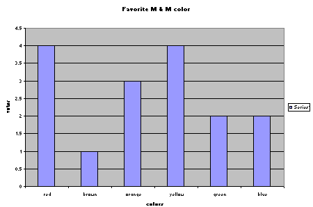
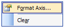
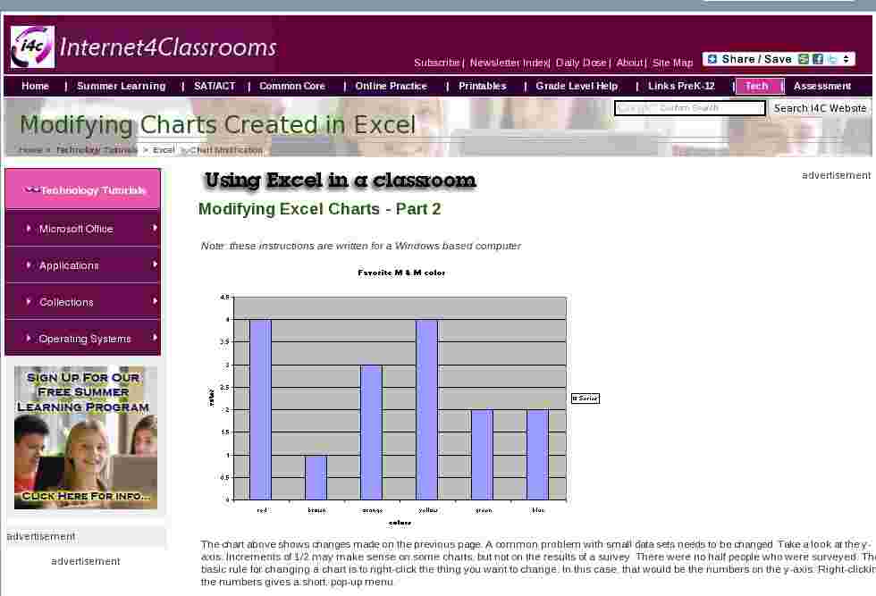
The chart above shows changes made on the previous page. A common problem with small data sets needs to be changed. Take a look at the y-axis. Increments of 1/2 may make sense on some charts, but not on the results of a survey. There were no half people who were surveyed. The basic rule for changing a chart is to right-click the thing you want to change. In this case, that would be the numbers on the y-axis. Right-clicking the numbers gives a short, pop-up menu.
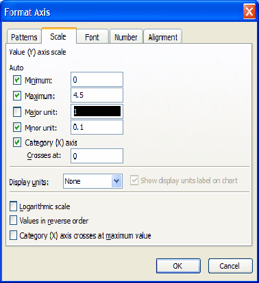
Clicking on the Format Axis choice beings up a dialog box with five tabs. Select the tab named Scale and change Major Unit to 1 rather than 0.5. If the numbers are not large enough, or if you want to change the color of the numbers, select the Font tab.
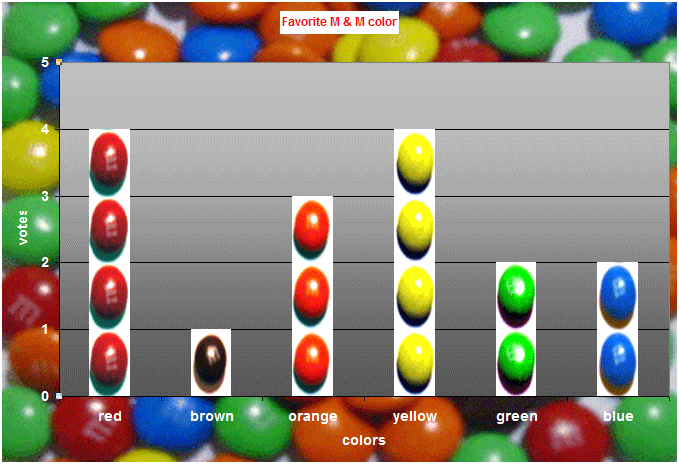
After making basic changes to the chart you might consider adding images. The first modification of this chart will be to produce a pictograph. If you would like to see more detailed instructions for making a pictograph, take a look at our module on the topic .
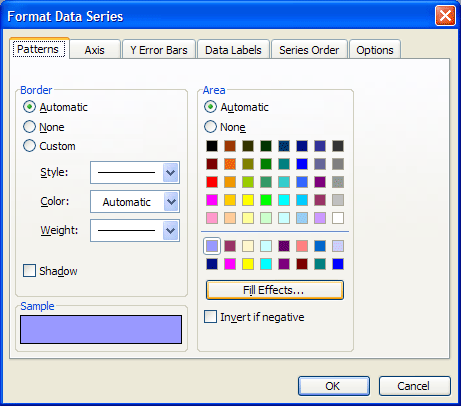
The first step is to insert a picture into the columns of the chart. Click on any column of the chart and you will see all columns selected. Right-click on any column to see the pop-up dialog box named Format Data Series . If you see Format Data Point only one column is selected, click away from the columns and try again. Click on Format Data Series to see the dialog box below. Select Fill Effects which is near the bottom on the right side.
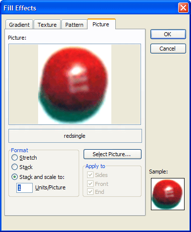
When the Fill Effects dialog box opens, select the Picture tab. Click on the button labeled Select Picture and navigate to find the picture you want to use. (I took pictures of M & M's for this project)
You may be thinking that I should not insert the same picture for all columns. The key to my answer is just to the right, in the Format section of the Picture box. I am going to format all columns to Stack and scale using one picture for each unit. After that, when I repeat the process to insert new pictures on each column, I will not need to select Stack and scale. All columns will already be formatted for that.
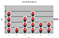
After selecting OK on this dialog box and the next to open, I had a chart that looks like the thumbnail chart below.
Repeat the steps above to insert appropriate pictures into each column. You do not need to mark the Stack and scale button, because you already did that for all columns the first time through.
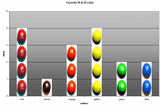
One final touch could be added, inserting an appropriate picture into the chart area. Right-click the white area around the chart, select Format Chart Area and follow the same procedure outlined above (without the stack and scale) to insert a picture into the Chart Area .
There are other changes which could be made, they will be outlined on the page which follows this one.

Internet4classrooms is a collaborative effort by
Susan Brooks and Bill Byles.

advertisement
advertisement
Use of this Web site constitutes acceptance of our Terms of Service and Privacy Policy.