| Sign Up For Our Newsletter |
| Sign Up For Our Newsletter |

Animate an Excel '07 Chart in PowerPoint '07
See this topic in: Office 2000 | Macintosh X | Office 2003
Excel charts aid in the interpretation of data. If you are displaying the chart in a PowerPoint show, an effective way to display the chart is one column at a time.
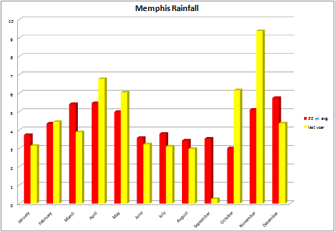
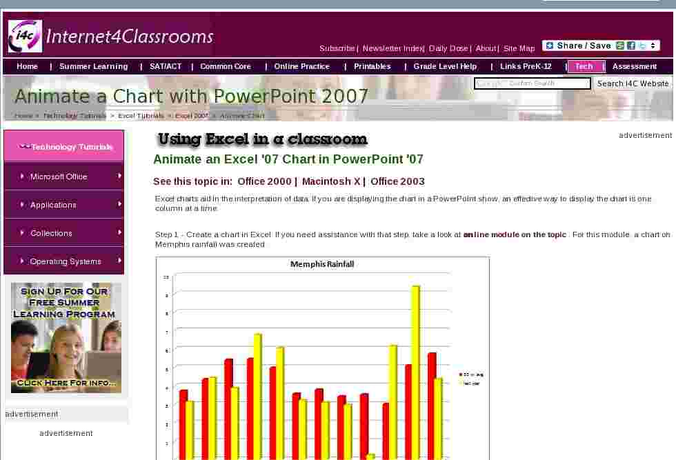
Step 1 - Create a chart in Excel. If you need assistance with that step, take a look at an online module on the topic . For this module, a chart on Memphis rainfall was created.
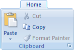
Step 2 - After the chart has been created, click in the white area surrounding the chart to select the entire chart. Copy the chart; hold down the Ctrl key before you tap the C key, or right-click and select copy, or click on the copy button on the Home tab in the Clipboard area. Use the method that you are most comfortable using.
Step 3 - Open PowerPoint and select blank slide for slide one. Paste the copied chart onto the slide; hold down the Ctrl key and tap on the V key one time, right-click and select Paste , or click on the Paste icon in the Clipboard area of the Home tab. Use the method that you are most comfortable using.
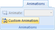
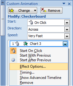
Step 4 - On the Animations tab, select Custom Animation in the Animations area of this tab.
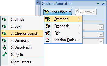
Step 5 - A Custom Animation pane opens on the right side of your screen. If Add Effect is grayed out, the chart was not selected before you went to this step. Click on the chart one time and Add Effect will be available. Select Entrance and then Checkerboard . If you do not see Checkerboard click on More Effects . (Note: some animations will not work for chart animation. After trying the recommended effect, go back and try some others.)
Step 6 - After selecting the effect, a rectangle with a green star appears just below the effect speed block. Click on the down arrow at the right end of the rectangle, and choose Effect Options.
Step 7 - When the Effect Option dialog box pops-up, select the Chart Animation tab. What you select next depends on how you want the columns to appear on the chart. Using the chart seen below step 1 above, here is what the choices would mean:
By series would display all of the red bars at once, and then a click would display all of the yellow bars
By category would display both bars in a month, and then a click would display the next month
By element in series would display the January red bar and then a click would display the February red bar
By element in category would display the January red bar and then a click would display the January yellow bar
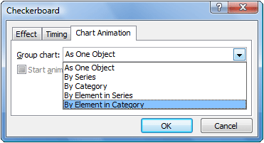
Step 8 - Before you click OK in the window seen above, click in the box labeled Start animation by drawing the chart background to deselect that option. You may try it both ways, but I prefer to have the basic chart grid on the slide as soon as the slide is displayed. That is just personal preference however.
See this topic in: Office 2000 | Macintosh X | Office 2003

Internet4classrooms is a collaborative effort by
Susan Brooks and Bill Byles.

advertisement
advertisement
Use of this Web site constitutes acceptance of our Terms of Service and Privacy Policy.