| Sign Up For Our Newsletter |
| Sign Up For Our Newsletter |

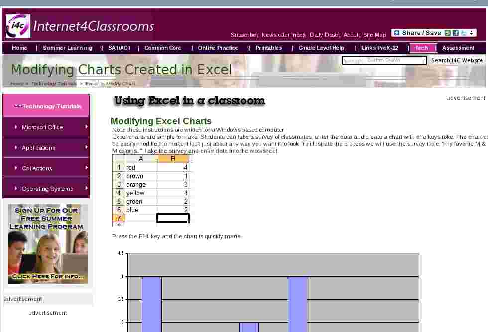
Modifying Excel Charts
Note: these instructions are written for a Windows based computer
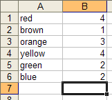
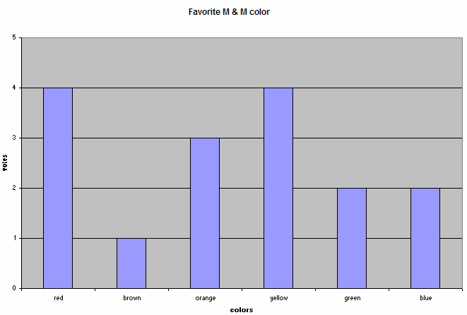
Excel charts are simple to make. Students can take a survey of classmates, enter the data and create a chart with one keystroke. The chart can also be easily modified to make it look just about any way you want it to look. To illustrate the process we will use the survey topic, "my favorite M & M color is.." Take the survey and enter data into the worksheet.
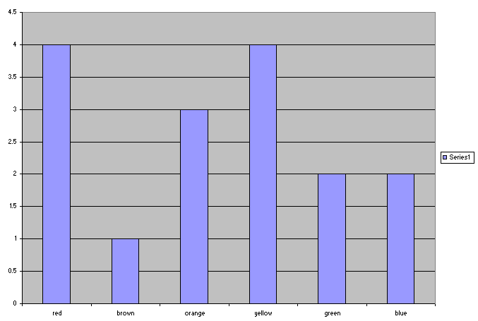
Press the F11 key and the chart is quickly made.
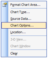
There are probably changes you would like to make to the chart. To change most things on a chart, right-click the thing you want to change. The first thing most teachers want to change is the lack of a title or labels on the x-axis and y-axis. Since you are basically changing the entire chart, you right-click the white area around the chart. From the pop-up menu, select Chart Options .
and then enter titles and labels
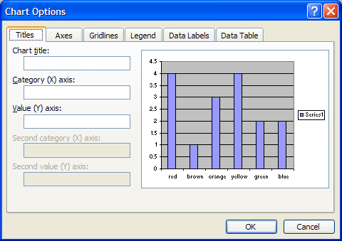
Other changes could be made from the Chart Options window. Some of those will be explored on page 2 of this tutorial.

Internet4classrooms is a collaborative effort by
Susan Brooks and Bill Byles.

advertisement
advertisement
Use of this Web site constitutes acceptance of our Terms of Service and Privacy Policy.
